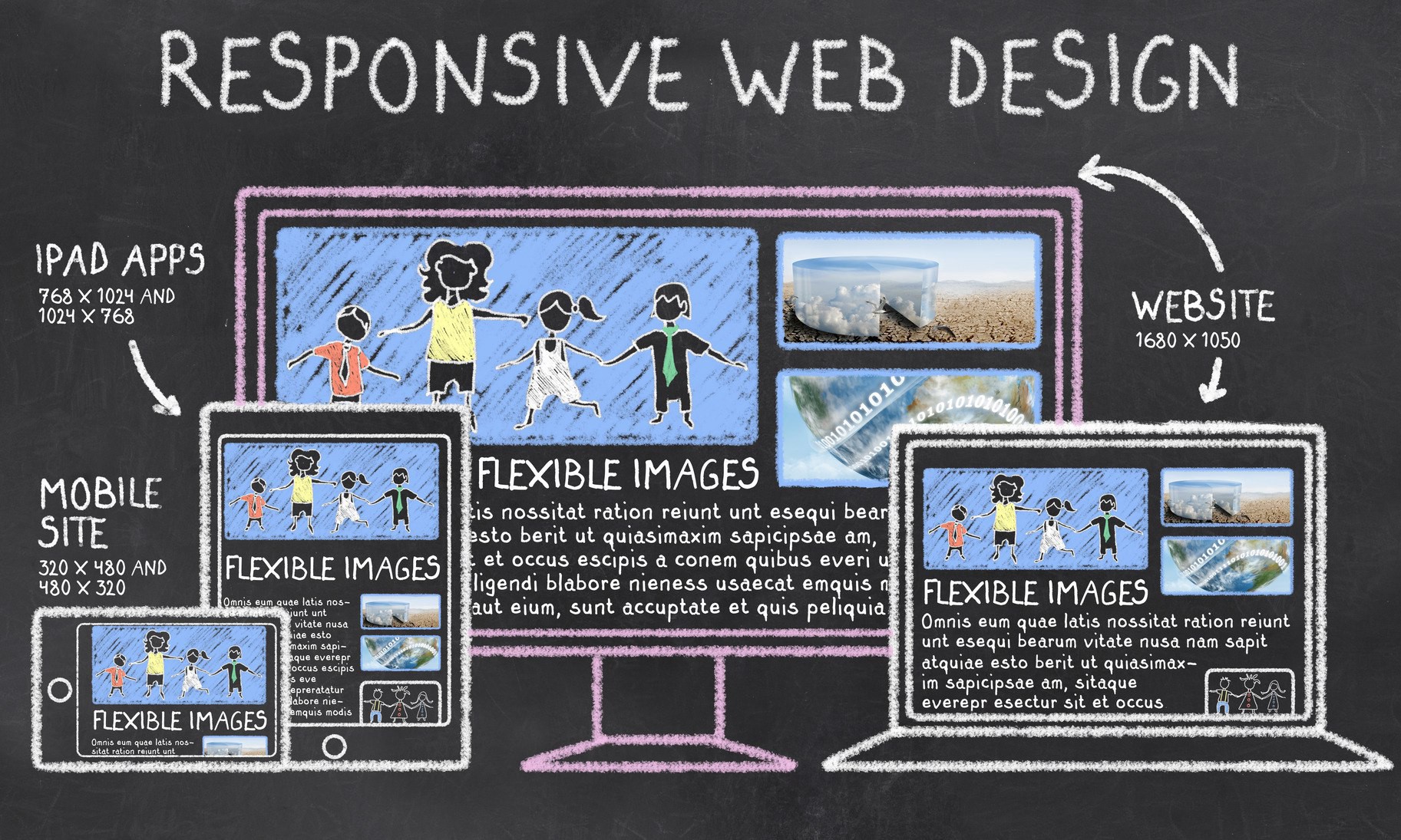
What Is Responsive Web Design?
Responsive Web design is the approach that suggests that design and development should respond to the user’s behavior and environment based on screen size, platform and orientation.
The practice consists of a mix of flexible grids and layouts, images and an intelligent use of CSS media queries. As the user switches from their laptop to iPad, the website should automatically switch to accommodate for resolution, image size and scripting abilities.
Best Practice & Considerations for Responsive Design
With responsive design, you design for flexibility in every aspect – images, text and layouts. So, you should:
1. Take the “mobile first” approach:
> Scale up phone-sized designs to suit larger screens.
Always remember that mobile users need large (>40 points) buttons. Also, your design must be twice as intuitive as desktop equivalents, since the need for well-sized elements on smaller screens can cause cramping and confusion.
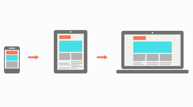
2. Create fluid grids and images:
> Create images in their native dimension. If you don’t have enough space, crop them to maximize impact.

3. Only use Scalar Vector Graphics (SVGs).
> These are an XML-based file format for 2D graphics, which supports interactivity and animations.

4. Prioritize and hide content to suit users’ contexts.
> Check your visual hierarchy and use progressive disclosure and navigation drawers to give users needed items first. Keep nonessential items (nice-to-haves) secondary.
5. Apply design patterns
> To maximize ease of use for users in their contexts and quicken their familiarity: e.g., the column drop pattern fits content to many screen types.
6. Aim for accessibility with font sizes/styles.
> Use contrast and background effectively. Make headlines at least 1.6 times bigger than body text. Make all text responsive so it appears in these proportions. As some users rely on screen readers, make all your text “real” instead of text within images.
Overall, responsive design is a powerful and economical approach, but its “easy” nature is deceptive. You can still run into difficulties if you use it without caution.
Irish Smith
Lorem ipsum dolor sit amet, consectetur adipisicing elit. Pariatur quidem laborum necessitatibus, ipsam impedit vitae autem, eum officia, fugiat saepe enim sapiente iste iure! Quam voluptas earum impedit necessitatibus, nihil?
Reply
Christine Stewart
Lorem ipsum dolor sit amet, consectetur adipisicing elit. Pariatur quidem laborum necessitatibus, ipsam impedit vitae autem, eum officia, fugiat saepe enim sapiente iste iure! Quam voluptas earum impedit necessitatibus, nihil?
Reply
Chintan Patel
Lorem ipsum dolor sit amet, consectetur adipisicing elit. Pariatur quidem laborum necessitatibus, ipsam impedit vitae autem, eum officia, fugiat saepe enim sapiente iste iure! Quam voluptas earum impedit necessitatibus, nihil?
Reply
John Doe
Lorem ipsum dolor sit amet, consectetur adipisicing elit. Pariatur quidem laborum necessitatibus, ipsam impedit vitae autem, eum officia, fugiat saepe enim sapiente iste iure! Quam voluptas earum impedit necessitatibus, nihil?
Reply
Ben Afflick
Lorem ipsum dolor sit amet, consectetur adipisicing elit. Pariatur quidem laborum necessitatibus, ipsam impedit vitae autem, eum officia, fugiat saepe enim sapiente iste iure! Quam voluptas earum impedit necessitatibus, nihil?
Reply
Jean Doe
Lorem ipsum dolor sit amet, consectetur adipisicing elit. Pariatur quidem laborum necessitatibus, ipsam impedit vitae autem, eum officia, fugiat saepe enim sapiente iste iure! Quam voluptas earum impedit necessitatibus, nihil?
Reply